Last updated at Wed, 03 Jan 2024 17:02:49 GMT
Data analysis is more than just collecting data and making it available (and that’s not analysis at all, actually, despite what some traditional SIEMs might claim). Analysis transforms data into something useful. It gives us insights, correlations, and trends that we can use to take action or change behavior. Analysis is powerful, but when analysis is married with data visualization, it becomes a story. Great visualizations allow us to consume complex information instantaneously, communicate to broad stakeholders, and influence viewers to take action.
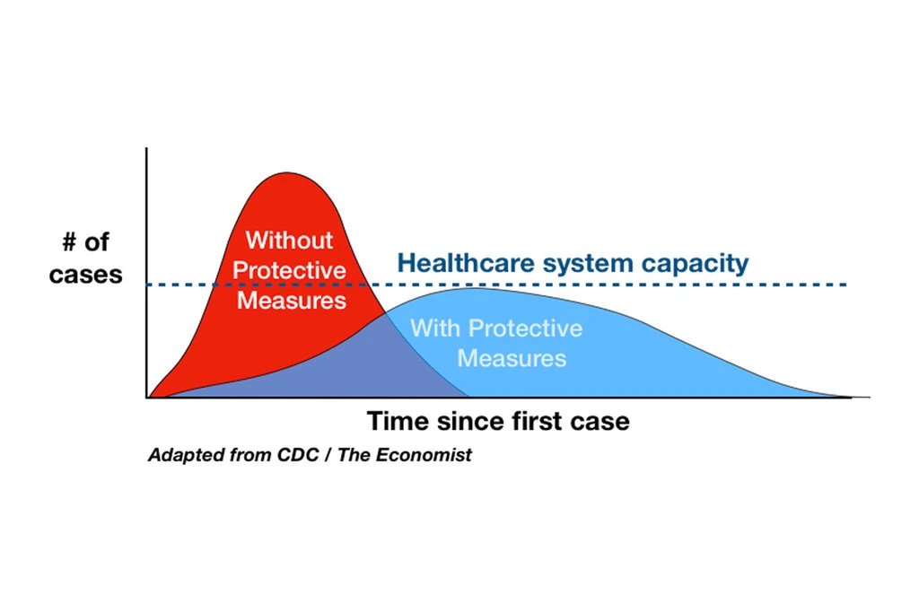
Visualizations are part of our everyday lives (outside of our security lives). One recent example: The “Flatten the Curve” chart that has consumed our newscasts for the past several weeks. With one simple visualization, we are able to see very clearly the importance of taking preventative measures to battle the coronavirus.
In InsightIDR, we know how important visualizations are for the analysts consuming them and the stakeholders with whom they share this data. A great visualization can:
- Save time when investigating a threat and evaluating an attack
- Align team members when interpreting new data
- Show stakeholders the impact that changes they make can have on security outcomes (e.g., the impact of not patching a vulnerability or the impact of one person’s weak password)
- Articulate in one snapshot to leadership teams the value of a change in process or technology
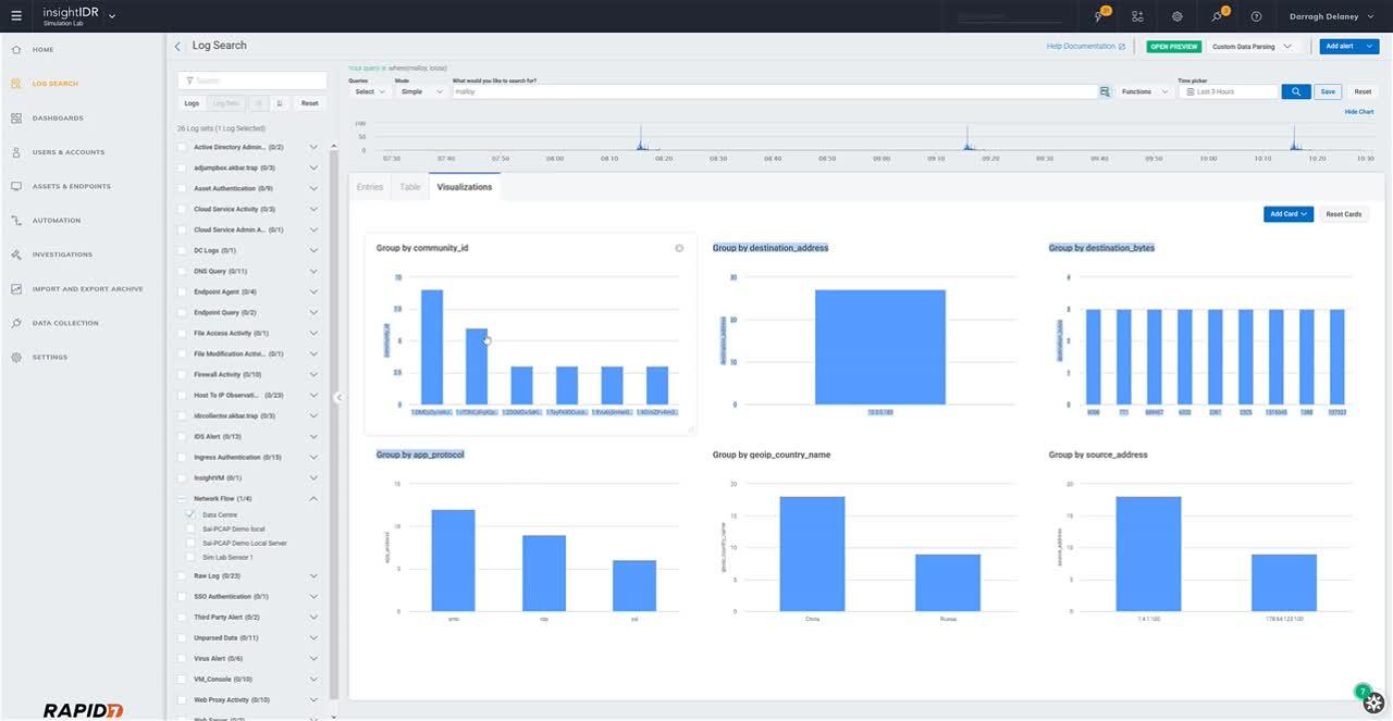
Visualizations make life easier. And that’s why we continue to invest in making it easier to create and access visualizations in InsightIDR. Most recently, we’ve updated our search feature in InsightIDR to include a tab for creating quick visualizations on the fly.
What’s new with Visual Search in InsightIDR?
Save time searching with the visualizations tab
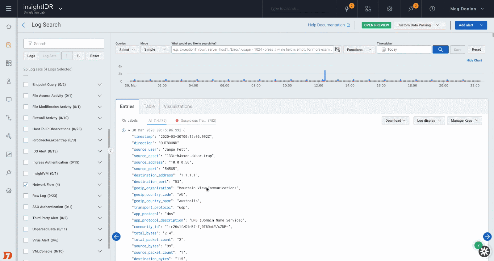
Where users could already see and format search result entries in raw form and in a table, they can now access a visualizations tab to see search results in a graphical snapshot.
Create new cards in seconds to help tell your story
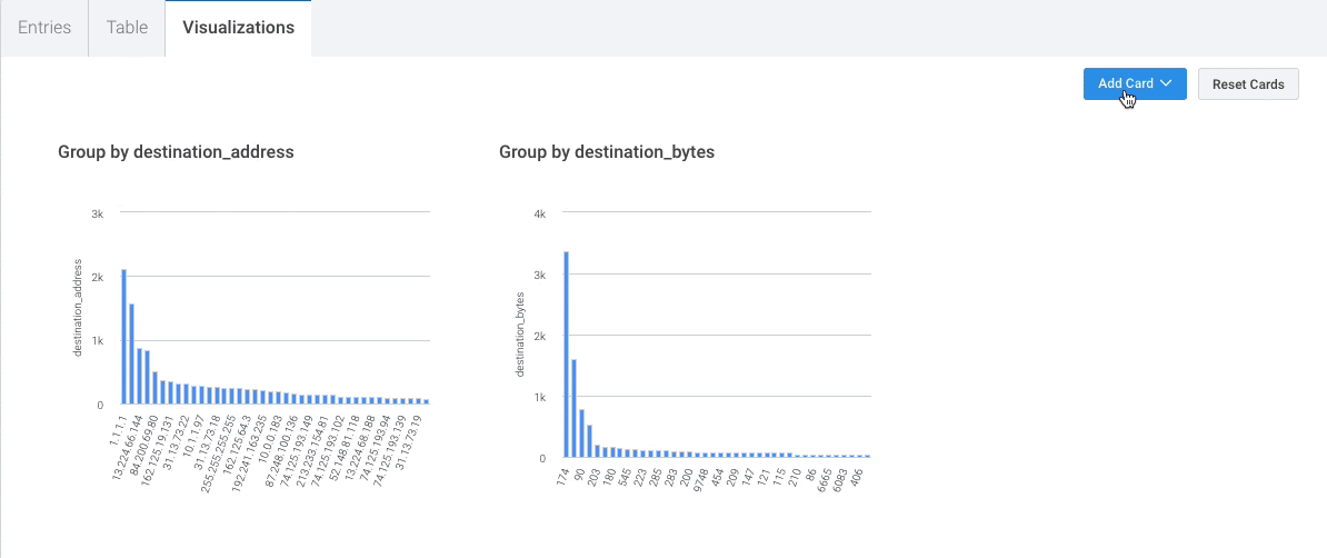
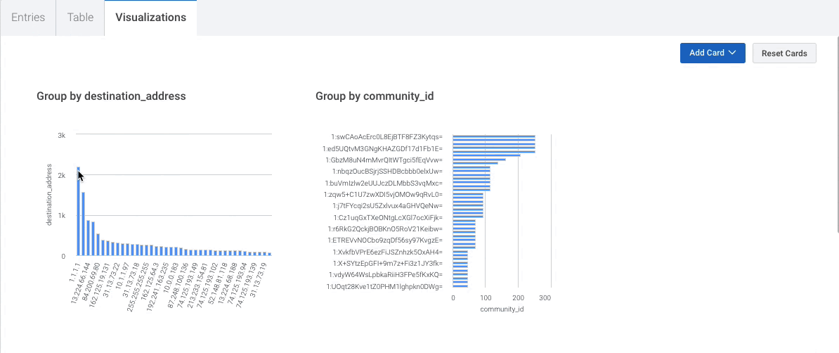
It’s easy to make new data cards in the visualizations tab. When adding a card, available metadata filters automatically populate as options to visualize. Preview card layouts before you create them. Then, easily slide across cards to rearrange data to highlight the items that matter most to you.
Filter with a click to analyze data and grab insights faster
Search faster by filtering data right from visualizations. Click on the segment or result of interest, and data is quickly filtered. This is also useful for comparing data points side by side to see key takeaways instantly.
Try Visual Search today!
Looking for a good use case to get started? In this four-minute video, our Lead Network Traffic Analysis Technical Product Manager, Darragh Delaney, walks through how to leverage Visual Search to analyze network data.
We’re excited about Visual Search and the time savings and storytelling it will unlock for our users. To learn more about using Visual Search, check out our help docs here.