Last updated at Tue, 31 Oct 2017 14:00:01 GMT
At Logentries, we use the open-source D3.js visualization library for a number of our graphs, including our recently released Insights feature. In a nutshell, D3 allows you to efficiently manipulate documents based on data with minimal overhead. While it could in fact be used for all types of DOM manipulation that you might do with jQuery instead for example, we have used it purely for its graphing functionality.
One of the reasons we chose D3 is because of the vast amount of examples available on github, which makes wire-framing much easier for designers. These examples are also easily adaptable to different data sets so a ground-up approach isn’t always required when creating your own graphs with D3. The other advantage is the fact that you’re not limited to using SVG, as there might be some scenarios where you would like to just use pure HTML
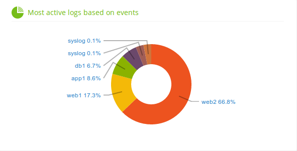
Below are some examples of how we used D3 on our Insights screen. This D3 donut chart was used to graph the breakdown of logs in an account based on event activity. Using some simple D3 functions, we were able to make each slice clickable which takes you to the log that it represents.
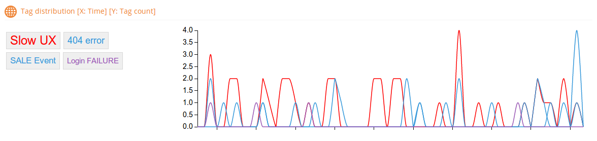
 The other nice addition in Insights was the D3 multi-series line chart. In our example, we show a timeline for each Tag event in your logs similar to our Aggregation view except of course it gives you an individual line for each Tag. We went one step further and added the ability to add and remove lines from the chart using our custom TagCloud on the left. This way you can really focus in on the information you need.
 All in all, D3 is a very useful graphics library with a complete set of examples and a large API reference.